The Importance of Controlling Your Digital Image Working Environment
One of the more common questions we’re asked is about how important it is to have a good working environment, from a colour perspective.
Usually this is phrased as ‘do I need to calibrate differently for day than for night?’ – the real question here is how much difference do night and day (in your particular working environment) practically make on your perception of colour?
Our answer is always the same – rather than create different calibrations, the far more effective approach is to control your digital imaging environment. This doesn’t mean you have to live in a grey painted cave – you need only take this so far as you need to in order to get the practical results you are looking for, of course. But some attention in this area can really improve your results.
It’s fair to say the environment around your screen – particularly directly around your screen (e.g. the wall behind it), and your lighting, can have huge effects on your ability to perceive colour. Don’t believe me? Consider these optical illusions:
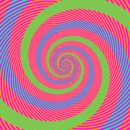
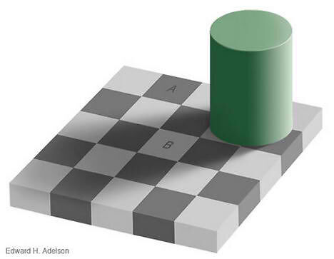
Both of these demonstrate the amazing effect that surrounding colour has on our perception of colour. It’s almost impossible to believe the tones in question are the same, but they are – and it’s quite simple to test in Photoshop. I find the grey tone example particularly interesting and use it regularly when teaching high level black and white printing (something that quite honestly very few people are good at). It shows how important local areas of tonality are and how crucial it is to break your image down into the sections when editing, addressing the local relationships between tones as well as the overall tonality that is the (relatively) obvious part.
There are a few basic things you can do to improve your working environment significantly. If you want to take it up to a high level we have more information (including paint formulas etc.) in The Digital Fine Print Book. But here are some inexpensive and very effective first steps to take:
Use a monitor hood
These are very affordable and perhaps more than any other thing will help your eye separate your working image from the surrounding environment. Once you’ve used one of these, it’s very hard to go back to a monitor without a hood. Our basic aftermarket model is just $85 and fit monitors from 15 to 26 inches – indeed, it will even squeeze on ok to the amazing NEC PA271W I have on my desk right now.
Control your lighting
Try simply shutting the curtains/blinds and endeavour to bring consistency to each working session. Move your screen into an area with steady, soft light.
Get colour accurate lighting
If you have halogen downlights, replace them with the world’s best light bulbs from SoLux. If not, at least get a colour accurate task light. All of colour management is built around D50 lighting, so it’s essential if you’re assessing prints that you look at them in good lighting.