Using ICC Output Profiles
The Basics
Before you start using your profile, make sure that you first save it, rename it if necessary, install it and back it up in case of computer failure.
Saving Your Profile
When you receive your profile via email simply save the .icc file attachment and follow the installation instructions below. (If you ordered multiple profiles, unzip the .zip file to get to your profiles).
Note: Generally you should not 'open' your profile by double clicking on it - this will most likely give you an error message.
Renaming Your Profile
If you're happy with your profile's name you can skip this step.
If you choose to rename your profile you will need to change both the external and internal name as the internal name is the one used by Photoshop etc. and it is best to keep the internal and external names the same.
On a Mac: To do so simply open the Colorsync Utility. Navigate to the profile you would like to re-name, and click the button labelled 'open' next to it. In the list of fields, find the 'desc' tag. Edit this to whatever suits you and save the profile. This will change the internal name of the profile. You can also change the external filename as you would with any other file in the Finder.
On a PC: There is a free Printer Profile Toolkit that can do this here. Install the application (using the icckit.msi installer), and open the Change Description program by going into the ICC Profile Toolkit folder.
Note:
- For ICCv4 profiles, you don't use the 'desc' tag - use the 'mluc' tag instead. (We typically supply V2 profiles as these are more generally compatible).
- After changing the internal profile name you must re-start Photoshop to get it to re-read the profile's internal name.
Installing Your Profile
On a PC
Install the profile by copying it on to the colour profile directory on your computer.
On Windows, you can just just right-click on the profile and choose 'install profile'.
If for some reason you prefer to install it manually, copy the file to this folder:
C:/windows/system32/spool/drivers/color
Re-start Photoshop if it is running, (or whichever ICC compliant application you are using), otherwise it won't see the new profile you have just installed. The profile should now be available in your list of profiles. It will be named "IS_Printer_Paper" or similar unless you've renamed it.
On a Mac
Copy your new profile to:
User/Library/ColorSync/Profiles (where User is your actual user name)
In OSX 10.7 and above (Lion), you will first need to un-hide the user Library folder (hold down the option key and use the 'Go' menu to reach the folder or go into the Terminal application and permanently un-hide the folder by running this command:
chflags nohidden ~/Library/
Re-start Photoshop if it
is running, (or whichever ICC compliant application you are using),
otherwise it won't see the new profile you have just installed. The
profile should now be available in your list of profiles. It will be
named "IS_Printer_Paper" or similar unless you've renamed it.
Backup Your Profile!!
The first thing you should do once you receive your profile is back it
up to reliable media or your Dropbox etc.
We keep
your profile here for a few weeks to give you time to test it, but
as we generate so many gigabytes each week we can't keep it forever.
(You can not rely on us to re-supply your profile when your computer crashes three years from now)!
Printing with Colour ICC Profiles
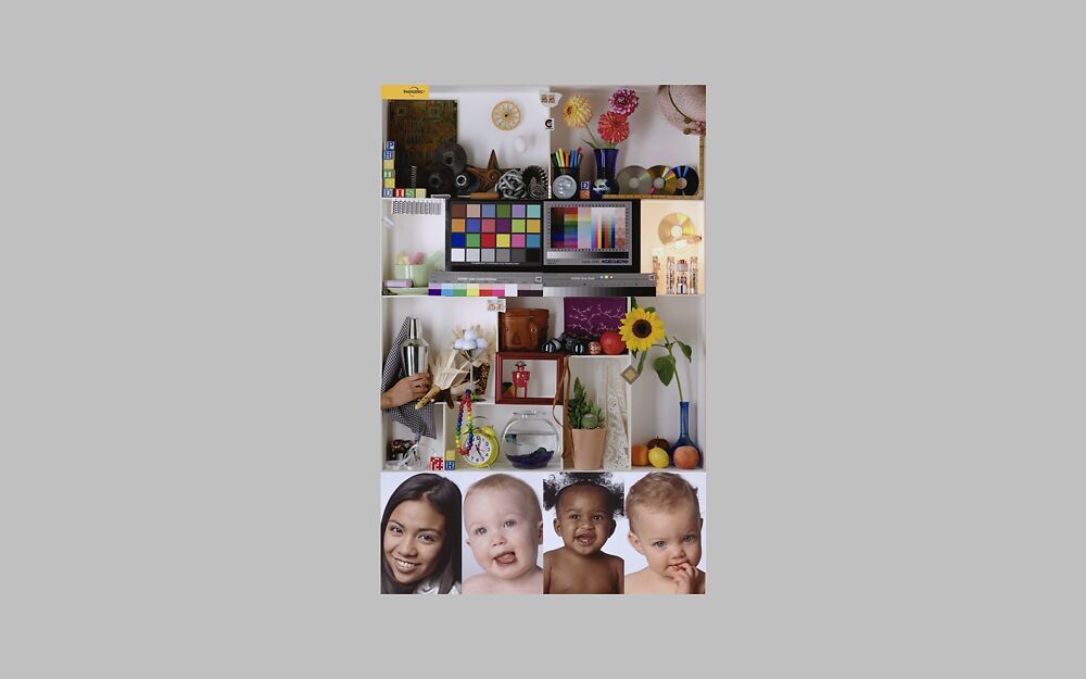
Suggested Evaluation Image
If evaluating your profile for the first time, we suggest you print
the industry standard printer test file from PhotoDisc.
When you
download this image from our website, it comes with notes on evaluating the
printed output.
We also sell copies of this image printed on a variety of papers so that you can see what sort of results you should expect from perfectly profiled systems on a paper that is similar to the paper you are using. You can find more detailed notes on evaluating profiles in the troubleshooting section of this article.
Making Prints Using Your ICC Profile
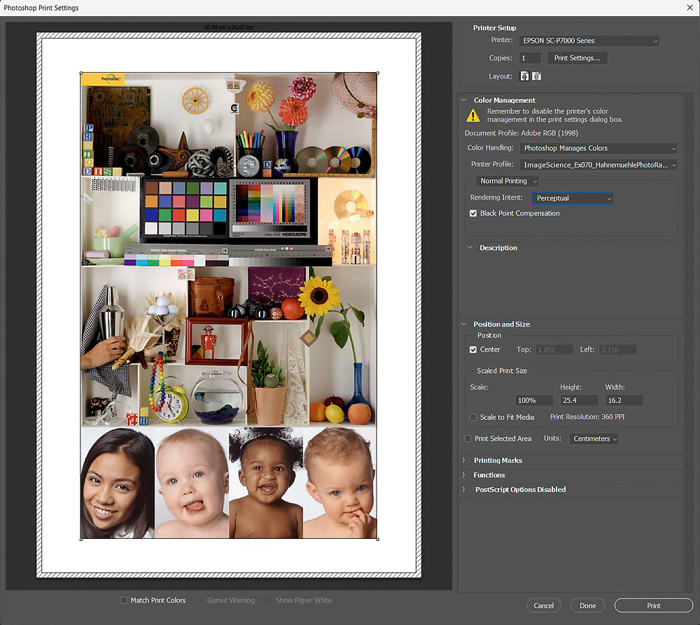
Printing with Photoshop CC
Go to 'Print' in Photoshop and check your settings match the screenshot below.
In particular, check that:
- The Document colour profile is correct (the image below is in 'Adobe RGB 1998')
- Colour Handling - choose 'Photoshop Manages Colours'
- Printer Profile: You have chosen your new printer profile
- 'Normal Printing' should be chosen (not hard proofing)
- You have chosen the Perceptual Rendering Intent (see further notes on this below)
- Black Point Compensation is ticked
Note that the settings under the print preview image (Match Print Colours etc), do not have any effect on the printed output, so it doesn't matter what these are set to. These switches control the soft proofing state in the print preview image.
When you are sure all your settings are correct, click 'Print'.
Now follow the instructions in Printer Driver Settings.
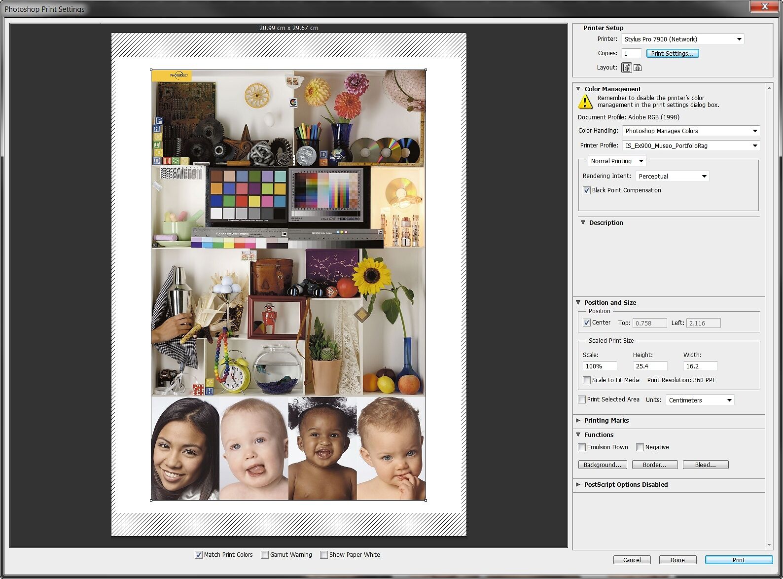
Printing with Photoshop CS6
Go to 'Print' in Photoshop and check your settings match the screenshot below.
In particular, check that:
- The Document colour profile is correct (the image below is in 'Adobe RGB 1998')
- Colour Handling - choose 'Photoshop Manages Colours'
- Printer Profile: You have chosen your new printer profile
- 'Normal Printing' should be chosen (not hard proofing)
- You have chosen the Perceptual Rendering Intent (see further notes on this below)
- Black Point Compensation is ticked
Note that the settings under the print preview image (Match Print Colours etc), do not have any effect on the printed output, so it doesn't matter what these are set to. These switches control the soft proofing state in the print preview image.
When you are sure all your settings are correct, click 'Print'.
Now follow the instructions in Printer Driver Settings.
Printing with Lightroom Classic
Adding and Enabling Your Profile
With each profile you want to use in Lightroom, you must first manually add it to the list of profiles.
Your ICC profile must be installed in the correct place as per the
instructions above. If you're sure you've installed your profile in the
correct place but you still can't see it in Lightroom following the
instructions below, then get in touch - we have a tool that can fix a
profile's name to make it visible in Lightroom.
In the 'Print' section of Lightroom, in the right hand panel, scroll down to 'Colour Management'. Next to 'Profile' use the drop down menu to choose 'Other'. This will bring up a list of available profiles. To make a profile available to Lightroom, simply tick the box next to that profile and click 'OK'
Printing Using Your Profile
Go to the Print Module in Lightroom.
Under Page Setup in your file menu (or the Printer button in the Print Module), make sure your printer and paper size is selected.
Scroll all the way down to the Print Job panel, under the Color
Management section, in the drop down list next to 'Profile' you will
find an entry for your new profile. Choose this.
Choose the Perceptual Rendering Intent (see further notes on this below).
Make sure that Draft Mode and Print Adjustment are unticked.
Now follow the instructions in Printer Driver Settings (accessed under Properties using the Printer button in the Print Module).


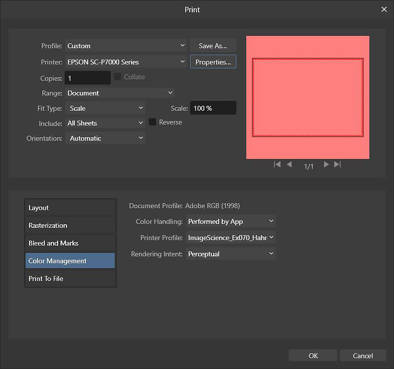
Printing with Affinity Photo
Go to 'Print' in Affinity Photo and check your settings match the screenshot below.
In particular, check that the 'Color Management' tab for the following:
- The Document colour profile is correct (the image below is in 'Adobe RGB 1998')
- Colour Handling - choose 'Performed by App'
- Printer Profile: You have chosen your new printer profile
- You have chosen the Perceptual Rendering Intent (see further notes on this below)
Under the 'Properties' button make sure your driver settings match those used when originally printing the target.
When you are sure all your settings are correct, click 'Print'.
Printing with Illustrator and InDesign
Both Illustrator and InDesign are very similar in that you want to ensure the following in your print dialog:
- The Document colour profile is correct (the image below is in 'Adobe RGB 1998')
- Colour Handling - choose 'Let Illustrator determine colors' or 'Let InDesign determine colors'
- Printer Profile: You have chosen your new printer profile
- You have chosen the Perceptual Rendering Intent (see further notes on this below)
Again, always make sure your printer driver settings match those used when originally printing the target (often the 'Setup' button at the bottom of the print dialog)
When you are sure all your settings are correct, click 'Print'.


Using Your Profile in RIPs like Mirage
In most RIPs, including Mirage, profiles are added to the media setup you create for the media. I.e. the workflow is - create a full media setup (with all the appropriate settings needed - e.g. paper type, print quality, ink levels etc. - this will vary greatly depending on your RIP). Then, use the RIPs profile target printing mode to print the target. Once you then have your ICC profile, install this into the colour management section of the media setup, and then your RIP should automatically apply it to all prints using that media from then on.
Obviously, we can't support RIPs as they're simply too complex and far too many variables specific to each RIP. Please consult your RIPs instructions for guidance.
Our Getting Stated with Mirage article covers profile use, but there are often good resources on YouTube too - e.g. this video showing installing ICC Profiles into a media setup in Mirage.

Printer Driver Settings
Very Important!!
The printer driver settings you use must match exactly the settings you used when printing your profile target image.
About Rendering Intents
Photoshop offers four rendering intents when printing images - Perceptual, Relative Colorimetric, Saturation and Absolute. Of these, only really Perceptual and Relative Colorimetric are used by most people when making prints.
Rendering intents are ways for a colour engine to map colours in your image that are outside the gamut of your printer into colours that your printer can print. Without them, you wouldn't get a very good print!
Generally, we recommend you use the Perceptual intent as the first choice with our profiles. This is because the Perceptual intent is the best intent for maintaining detail, in particular shadow detail, in a print.
You can also try Relative Colorimetric, which can sometimes preserve the accuracy of your colours better - particularly block colours, but has a tendency to cause some shadow clipping with very dark images (i.e. loss of shadow detail).
Ultimately, the choice is an aesthetic one and there is no one right answer for any particular image. Only a test print will show you the effect in full as it will be realised on paper, although soft proofing can give you quite a good impression as well.
There is a much more comprehensive discussion about rendering intents in the Digital Fine Print Book.
Soft Proofing
Soft proofing in Photoshop can be very precise and effective, but it does take some time to get used to the process. A good understanding of what it is trying to show you is also an essential part to getting the most from it.
In essence, soft proofing uses your printer profile
to give you a colour accurate on screen proof of how your image will
look once printed. It is designed to show you what changes the printing
process will cause to your image.
Photoshop offers two types of Soft Proof. The first is a colour soft proof that will show you what colour shift to expect when printing your image. This is the soft proof view that is most appropriate for most people on most occasions, as it is simple to use and will identify any major issues with your file and/or printing system, before you actually make prints.
This method of printing tends to be the most perceptually accurate - that is it gives the best overall impression of how your image will look in print.
The second type of proof shows you both colour and contrast changes that will occur when you print, by attempting to simulate all aspects of the final print including the noticeably lower contrast of paper, and by showing you what the print will look like under perfect, very bright lighting conditions. The soft proof can be quite a shock to the eye, due to the sudden drop in contrast, and often causes more confusion than help.
It is best to think of this type of soft proof as a useful tool for checking shadow and highlight detail levels, but overall it often tends to be less perceptually accurate - that is it can actually give you a less good idea of how the final print will actually look. It is still very useful nonetheless.
We discuss each method in a separate section below.
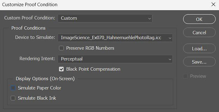
Basic Soft Proofing (Colour only)
For most people, the basic soft proof is sufficiently accurate as to be useful and to give a very good perceptual indication of how the print will look under typical viewing conditions. This soft proof simulates only colour shift, but does not attempt to simulate the actual print contrast. This in fact works well for evaluating how your prints will look in typical real world home/office lighting conditions (about 500 lux, diffuse non-direct lighting).
To create a soft proof set-up that uses your new profile, choose 'View->Proof Set-up' and set up as per the screenshot below:
- Choose your new profile as the 'Device to Simulate'.
- Make sure 'Preserve RGB Numbers' is NOT ticked.
- Rendering intent is usually Perceptual or Relative Colorimetric but you can of course proof for any rendering intent you like - remember to set the same intent in the print dialog box when you come to actually print though!
- If you are proofing with one of our print service profiles, for having your prints done by us, please note we will use the perceptual intent unless you instruct us otherwise.
- Do not check 'Simulate Paper Color' or 'Simulate Black Ink'.
- Black point compensation should always be checked.
- If you want to save this proof set-up, click Save and give the proof setup a name.
- Finally, click OK to turn on the Soft Proof and go back to your image.
You can toggle proof colours on and off (and the gamut warning) by using the controls in the View menu. Ctrl/Apple-Y also toggles the proof on and of. You will see in the title bar for the image that the name changes as you toggle the proof on and off.
How to use the basic soft proof
Use this proof to identify any significant issues with your image, profile, or the image edits you have made. You can also edit your image with this view turned on. We have more notes on this below.
As you turn the proof on and off, look for areas that change colour significantly.
Common problems you might see and their causes:
- Often highly saturated tones are not achievable on inkjet printers, so you may see some areas of strong colour changing in tone.
- You may see issues such as banding in shadows - this is usually indicative of a problem with either the original capture (eg underexposure of shadows on a lower end digital camera often leads to poor tonal separation), or scanning (cheaper scanners can cause tones to bunch up very tightly - take a look at our premium film or artwork scanning services if your finding this to be a problem)
- Banding or colour defects in non shadow areas - the issue will often be with your edits (strong adjustments in Photoshop can induce banding - try turning your layers on and off to see which layer is causing the problem).
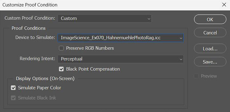
Advanced Soft Proofing (Colour and Contrast)
Advanced soft proofing is a technically more accurate type of soft proof that works to give an accurate simulation in terms of both colour change and contrast change from screen to paper.
For advanced soft
proofing to work effectively, your environment needs to be highly
controlled - i.e. the correct neutral grey walls, D50 lighting installed
and measured, the image displayed without white on screen, and your monitor appropriately calibrated.
You also need to remember this soft proof aims to show you how your print will look under exhibition lighting - that is, under bright, D50 spot lights, so it may not be an accurate simulation for the real conditions in which you work and view your prints. It is very unusual for the average home/office environment to have lighting that resembles exhibition lighting - most common wall lighting is diffuse and 500 lux or less, whereas most exhibition lighting is point/spot lighting and around 2000 lux.
The initial drop in contrast that occurs when you first turn on your soft proof can be so severe that your eye can have great trouble accepting it. On a modern LCD the contrast drops from typically around 1000:1 to maybe 200:1!
(Eizo ColorEdge CG level monitors are perfect for print production as they can very easily set their own physical contrast to a level that exactly matches the paper you are using, meaning you are effectively proofing in contrast terms during your entire editing process).
To create a soft proof setup that uses your new profile, choose 'View->Proof Setup' and set up as per the screenshot below:
- Choose your new profile as the 'Device to Simulate'.
- Make sure 'Preserve RGB Numbers' is NOT ticked.
- Rendering intent is usually Perceptual or Relative Colorimetric but you can of course proof for any rendering intent you like - remember to set the same intent in the print dialog box when you come to actually print though!
- If you are proofing with one of our print service profiles, for having your prints done by us, please note we will use the perceptual intent unless you instruct us otherwise.
- Check both 'Simulate Paper Color' and 'Simulate Black Ink'.
- Black point compensation should be checked.
- If you want to save this proof set-up, click Save and give the proof setup a name.
- Finally, click OK to turn on the Soft Proof and go back to your image
You can toggle proof colours on and off (and the gamut warning) by using the controls in the View menu. Ctrl/Apple-Y also toggles the proof on and of. You will see in the title bar for the image that the name changes as you toggle the proof on and off.
How to use the advanced soft proof
Use this proof to carefully check shadow and highlight details. You can also edit your image with this view turned on. We have more notes on this below.
To correctly use this proof, you must turn it on when no white is visible on your screen - at all! This means, you must enter full screen mode in Photoshop (hit 'F' three times) and hide all the palettes and rules (hit 'Tab').
You should see only your image against a plain background - ideally neutral grey, with nothing else showing on screen. You can change the background colour in Photoshop by using the paint bucket tool to fill the background!
Remember, particularly with very matte papers with weaker black levels, there is a vast difference between the contrast range of your monitor (typically 500:1 or more) and the contrast range of a matte print under exhibition spot lights (closer to 150:1) - and this will be reflected in the soft proof. It can be hard to get your eyes/head to take this on board though, and you may initially be a little surprised by the sudden drop in contrast. The reality is, while this proof is technically more accurate, it simply doesn't look as much like the print as the basic soft proof, unless you are looking at your print under very unusual lighting.
The way to use this view in practise is to use it to check where real, printable detail emerges from pure black shadows and paper white highlights. Zoom into your shadow areas and turn the proof view on and off, and you will get a very good idea of how the black level of the paper will affect your shadow detail. You can do the same thing with your highlights, and you will see how the base colour of the paper will effect your highlights when printed. This should give you the ability to very precisely control your shadow and highlight detail.
Really Advanced Soft Proofing With Eizo CG and BenQ SW Monitors
Soft proofing on a direct hardware calibrator monitor is a completely different experience. The contrast problems that you have with a standard LCD monitor are no longer an issue - they have the ability to manipulate the contrast ratio of an LCD screen without huge unpleasant side effects, and with measured accuracy.
With these screens, you can use Eizo's excellent and very easy to use ColorNavigator software, BenQ's Palette Master Ultimate/Elements, to control your monitors black point and set a specific contrast ratio as desired - for example 200:1. And because of the fantastic high bit depth circuitry in these monitors, this adjustment is carried out without visible side effects (try this same adjustment on a typical Dell or Apple etc screen and you will immediately induce huge banding in your grey-scale gradients).
At the end of the process you are left with your monitor displaying the exact contrast ratio you require - you can even input a measured paper white point and set the white point of your monitor to that of your paper so the entire display is adjusted to be as close as possible match to your final output medium! This is an amazing piece of technology that takes soft proofing and colour management to a whole new level.
If you use multiple papers, you can create multiple 'hardware based soft proofs' for your papers and dynamically flick between them at the click of a mouse using ColorNavigator. It's pretty amazing stuff and because the eye does not have to go through a huge contrast adjustment when you turn on soft proofing, it makes the whole process far, far easier. And this means more accurate prints - and that's the goal, after all.
Editing With Proof Colours
You can use any of Photoshop's tools to edit your file with the soft-proof turned on. This allows you to target your edits for the best possible result on a specific printer . We suggest you save an alternate copy of your file and keep your master file so that you can re-target this file to other output devices if required at a later date.
Remember - with the Soft Proof turned on, you are working directly within the constraints of the printer's palette so will be able to make the best decisions about your edits - however, some adjustments may not be achievable simply because those colours are not achievable on your printer!
Using Your Black and White Profile
All the notes above apply equally to black and white profiles, but here's the short version for specifically using black and white profiles - either in Photoshop or in a RIP (the process is slightly different).
If printing using Photoshop (say through the Advanced Black and White mode in Epson printers) - you proof and use the profile exactly as per the instructions above.
Note: You must always use the Perceptual rendering intent for both proofing and printing when using Black and White profiles.
If using another program to do you prints, such as QuadtoneRIP which has it's own GUI, then it's slightly more complicated, but not much. Soft proofing is set up as per the instructions above, but there is one extra step before you actually make the print. In Photoshop go to the Edit menu and select - Convert to Profile
Choose the new profile you've received, the Perceptual Intent, and make sure Black Point Compensation is checked and select ok.
Now, save this file, and print this from the QuadtoneRIP GUI as normal, remembering that you must use exactly the same settings in QuadtoneRIP as you did when printing the original target file, or the profile won't work.
Troubleshooting
Profiling really works, and works extremely well. For many people, it is a real watershed moment in their photographic journey as they can, at last, achieve complete control of their printing. Of course like all complex things, things can occasionally go wrong.
If you're having trouble with your profile, read this section to
help identify where the problem lies. If it doesn't answer your question
or solve your problem, then contact us - we are more than happy to
help! The whole point of profiling is high quality, precise results and
this is what we want you to achieve.
Soft Proof & Print PDI Test Image
Whether your problem is big, such as a corrupted profile resulting in psychedelic colours, or small - you suspect the profile is causing a colour cast, the first step is to find out if the profile is causing your problem, or something else.
The easy way to do this is to Soft Proof using the profile. The Soft Proof is showing you what the profile is actually doing to your file. If you can't see a problem in the soft proof, it is almost 100% certain that the problem lies with your printer settings when making the print. Go back and double check that you are using all the exact same printer settings you used when making the targets, remembering to check even the minor switches.
Really obvious faults will show up quickly in a soft proof, however more subtle issues are harder to assess, and it comes down to the quality of your screen and its calibration in many cases. However you can not judge a profile only on its soft proof - the accuracy of the soft proof depends a LOT on your working environment and equipment (room lighting, wall colour, screen quality etc), so you must definitely try real prints before drawing conclusions about your profile.
What Does A Profile Do?
To tell if a profile is actually working properly, it is best to first understand a little about what a profile is actually trying to achieve.
A profile is trying to give you the most accurate reflection of the colour numbers in your file as a print on paper. More technically, it is trying to create the best possible mapping between the gamut of your working space (which absolutely limits the colour achievable in a particular file) and the gamut of your output device (which is absolutely limited by the ink set/driver/chemistry of the system in question).
A profile is a solution to a complex multiple objective optimisation problem - that is, it is trying its best to satisfy many goals at once, and consequently some compromises are inevitably made. In mapping from your working space to your output device's capabilities, a profile is trying to achieve such things as:
- Good behaviour along the saturation boundaries (ie very saturated colours do not block up and become blobs of undifferentiated colour).
- Linearisation along the colour axes (ie the steps between colour densities are linear and as expected, e.g. 10% to 20% red is indeed a 10% change).
- Greyscale neutrality (of a particular ink set on that particular paper, with respect to a specific lighting source)
- In all - the best most accurate general output for that device as a whole for a given specific light source (D50, exhibition lighting).
- All of the above in sympathy with the paper type. That is, if you're using a warm paper, a good profile will not try and neutralise the warmth out of paper, and the same with cool papers.
The corollary of this is that a profile is NOT trying or able to achieve certain things:
- A profile is not trying to make a particular image match exactly across paper types.
- A profile can not eliminate metamerism inherent in the ink set - it can however achieve best neutrality under a particular light source while trying to minimise shifts from neutrality under other light sources
- A profile can not fundamentally improve your printer and/or driver. The gamut of your printer is determined by what inks are being used and how they are mixed and laid down on the paper - this is controlled by the printer driver. It can only give you the best colour possible given the way the ink is put down by the printer/driver. Generally, the only way to change ink delivery in the printer driver it to change the paper type. Once you have determined the best paper type, a profile is the best next step. If you use the wrong paper type and the driver is simply laying down way too much ink, then not even a profile will save your shadow detail.
- A perfect screen to print match. The profile is trying to describe and best use your printer's colour. A screen calibrator (like the Eye One Display V2) tries to best describe your screens behaviour with respect to colour. These things are entirely separate. You don't want either your screen, or printer, to be limited by the capabilities of the other. Where the gamuts are the same, then they should match. The profile does try and give you the best soft proof for an image.
The Best Way To Test A Profile
Printing things like the ever popular PDI printer test file, or some of your own work is the best way to test a profile, not just by Soft Proofing. Make sure you live with the profile for a while as well, and don't make snap judgements based on a single image. A profile is a complex thing and making judgements about one takes time and careful consideration.
If a profile is seriously corrupt through some misadventure then this will be quickly visible in print outs - the PDI target covers a broad range of your printers gamut and is particularly good at showing obvious faults.
So how then do you know a profile is 'correct' or the best profile?
There's really no such thing as 'the best' profile. It's always possible, for an individual image, that there is a profile better suited to that image - for example, there may be a profile that is less neutral but geared towards more saturated colour which works better for your yellow canary shots. What can be said is that a good profile is the best set of compromises for general photographic image reproduction.
If you print out the targets correctly, and following the
instructions precisely, you'll receive an accurate profile.
Our
equipment is self diagnostic, and we use the very latest profile
building software to produce the profiles - to date, in over 15 years of
making tens of thousands of profiles, we have yet to have a single instance of a
'bad read' or process fault at our end. Literally not once.
My screen still doesn't match my print
The goal of a profile is not to make a perfect screen to print match - this is simply not possible because the gamuts of the devices are not the same. The goal of a profile is to give you the best ability to 'soft-proof' for your printer's output and to take best advantage of your printer's physical gamut, to then give you the best possible prints.
The most common cause of this problem will be that your screen is inaccurate. Assuming your screen is of decent quality, (not a cheap LCD, read more on this here) then it must be hardware calibrated for you to make any judgements with it. If you are basing this judgement on a bad monitor, or a monitor that is calibrated only with Adobe gamma, or not at all, then we can guarantee you that your screen is the problem.
Experience has shown that 99% of all people who have problems using profiles, solve those problems by using good quality hardware based screen calibration. It is in fact the screen which is out, not the printer profile. When using an uncalibrated screen you are creating files with a colour cast in them in the first place and an accurate printer profile will show you the colour cast even if your monitor won't.
The number two cause of this problem is gamut difference between screens and printers. The simple fact is your monitor can display certain colours you will never be able to print, and indeed your printer can print colours you will never see on your screen. Photoshop's colour engine is remarkably good at overcoming this problem and soft proofing, when set up correctly, can be an uncannily accurate system. Combined with the gamut warning, it is very easy to see the problem areas in your print and you can adjust the image, while viewing with the proof colours, to make for a better print on that output device.
My image still looks great on screen but not as a print!
Sometimes that's just the way it is. An emissive, on screen image is a fundamentally different thing to a reflected, on paper image. You can improve the matching of tones between screen and print with good colour management, but you can't fundamentally change the nature of screens and paper. Learning to print images on paper with great luminous depth and 'glow' is a real skill and colour management is just one of the tools required.
Note: Please contact if there is anything you need clarified. These notes are for convenience and we are more than happy to speak to you and answer any questions.
My Print Is Too Dark
Probably the most frequent problem reported with printer profiles is that they are too dark. This problem is reported much more frequently now than it was a few years ago due to the market domination of LCD monitors, and the failings of lower end LCD monitors. The problem in this case is always that the monitor is too bright.
Brightness between screen and print is a difficult thing to get just right. Fundamentally, a light emitting device like a screen is a poor simulation device for a reflective medium like paper. To get things closer, but to also maintain colour accuracy, is a gentle balancing act between screen brightness and control of light in your viewing area.
The first principle of this is that in a proper digital imaging environment, the most important thing to get right is the ratio of light level between your screen and the light surrounding your screen. Prevailing thinking suggests that you should have your monitor 30 to 50% brighter than the light surrounding your monitor. In theory, as long as the ratio is maintained, the actual level of brightness of both should not matter.
The reality is that if your monitor is much brighter than a point of
about 120 cd/m2, then soft proofing tends to break down - no matter how
light your room, the onscreen display of your images will appear
brighter than your prints. This is a big problem with cheaper LCD
monitors because many of them, even with the brightness turned all the
way down to zero, still measure 200 cd/m2 or more! There is simply
nothing that can be done with these monitors to make them better tools
for image editing - they just don't have the controls for it.
Better monitors, like Eizo screens, have much better control over brightness and can be set to more sensible levels. In our offices, which are quite bright, we run the screens at 90 cd/m2. In a darker room, around 60 cd/m2 often works best. You can see that if the minimum brightness available to you is twice as bright as this, or even more, you are going to have great difficulty simulating paper on screen - because paper simply never looks anything like a monitor set to those levels of brightness.
What can you do to solve this problem? First check you are calibrating your monitor to a sensible brightness level. Cheaper calibrators don't tend to tell you what the brightness is or guide you through changing it. We recommend upgrading your calibrator to solve this, but as a minimum try simply setting the brightness of your monitor to a much lower setting, even zero, and recalibrating your screen. If at zero brightness you are still finding it difficult to match density between screen and print, you really need to consider buying a better monitor.
With proper calibrators that allow you to define a brightness
target, try around 90 to 100 cd/m2 as a starting point. If your screen
can achieve this brightness, you will probably find your problem solved.
Make a print of the PDI test image and check it against your screen.
You this by looking at the print independently under good lighting, then
look at your screen - is there an overall feeling that the two match in
density?
Note: Do not hold the print next to your monitor as then the eye
must cope with reflective and emissive light at the same time and you
will always find your print darker!.
If you are still finding your monitor too bright, re-calibrate to a lower brightness target and vice versa if you are now finding your prints too light. Very soon you should have found the right brightness target that works for your work area. Stick to this and you should find you get excellent screen to print matches!
A Quick Discussion On Shadow Detail

One thing we are often asked is why can't I easily see differentiation between RGB 15,15,15 and RGB 0,0,0 on my custom profiled print? The first thing you need to realise is that the human eye is particularly bad at seeing difference in dark tones when they are surrounded by white, so when looking at your print this differentiation may not be obvious. You will often only see this difference when you print substantial areas of these tones, when they are near each other and only when they are not surrounded by white.
This is an easily testable fact. Make a print of a very dark grey
tone - say RGB 30,30,30 - on a small piece of paper. Now make two small
frames, one from bright white paper and one from black card. Place them
immediately around your print and then swap between the two frames.
You'll see your grey tone change brightness levels right in front of
your eyes - it's quite hard to believe at first. There is also a famous
picture which shows just how big a difference surrounding tones can have
on our perception of a colour. It's pretty amazing really.


Another thing to try is to do a printer test again, but cut all the white paper around the edge off and do your patches at a much bigger size. You may well see that the difference you thought wasn't there actually is.
The second reason may be simply that you're using a lower quality printing device that is really quite bad at shadow detail. A profile will go some way to helping this but profiles are good at small nudges, not huge sweeping corrections, so it may be that your printer just isn't up to the job. And if you're printing with the Relative Colorimetric intent (rather than Perceptual), you are pretty much asking Photoshop to clip your shadow detail. Try printing again with the Perceptual Intent and you should see in most cases much better shadow detail (more about this can be found in our Digital Fine Print notes).
The third reason may be your choice of working RGB space. Most photographers in Australia use AdobeRGB and with good reason as it is an excellent general purpose colour space. However, it has quite a significant compression to its shadows - more so than some other colour spaces. You can check this by creating a white to black gradient in Photoshop and then running your mouse over it with your info set to LAB mode. You will see from this that AdobeRGB is not visually linear in deep shadows - you have to go all the way up to RGB 25,25,25 to get to LAB 5 - or put simply you are numerically about 10% along the scale when in visual terms you are only at 5% of the scale.
That is, there is not a lot of correlation between the AdobeRGB numbers and what we might expect. You would think that if we moved 10% up the scale in numbers, we'd move the same amount in brightness, but we don't. It's an easy trap and although your monitor profile should be sorting this out for you and placing everything in the appropriate spot visually, it tends to be an area where both cheaper calibrators and cheaper monitors are weak. So often, on your monitor, the light flowing through these parts of your image will make them look significantly brighter than these areas are going to look in print - even for the most accurate print in the world. This doesn't meant that AdobeRGB is a bad colour space - it just means that you need to be more careful with placing shadow detail in AdobeRGB than in sRGB. If you're testing a printer using a printer test file, you should make sure it's been properly designed for the colour space it is in, as most of them are not. The PDI printer test file is quite good for testing in these situations.
The final thing to look at is your lighting. Printer profiles are built to simulate D50 lighting at a great level of brightness (approx 2000 Lux). This is very bright light, so when assessing your prints/profiles, make sure you are looking at them under a bright lights. Two Ilford Ilfolux lamps are perfect for this. If you're under typical room lights at night, you will simply not be seeing shadow detail that is most likely easily visible under a brighter light.
How To Get Support
If you think you are having a problem with your profile, we do ask that you send us through a print of the PDI test image with the Perceptual intent, along with screenshots of all the relevant settings when you made the print - including the Photoshop colour settings, the Print settings in Photoshop, and all relevant pages of your printer driver. Also send us the screenshots of the settings you used to print the original target image.
Custom Printer Profiles are complex things and this will make it easier for us to help you and uncover the problem. Feel free to contact us if you have any questions about this process.
You can also go through the target printing instructions again and print another copy of the target in case we need to re-make the profile. There will be a $25 fee for this if you made a mistake printing the original target as we have to re-do the entire process as our end. There will of course be no fee if we made a mistake.
Checklist
What to send through to us:
- Screenshots of all the settings you are using to make prints with your profile (including Photoshop's Colour Settings, Print Page, and all printer driver settings)
- A print out of the PDI printer test image made with the Perceptual intent
- Screenshots of the settings you used to print the original target image
- A new copy of your profile target so we can re-make the profile if necessary