Fundamentals Of Digital eBook
The Fundamentals Of Digital in downloadable eBook form (PDF, ePub and Mobi included)
▪ Free Shipping - this product ships free!Please note that we are open by appointment only (except for click and collect pickups once notified ready).
A technical article going into the methods necessary to accurately and correctly compare prints to screen, and the challenges of doing so.
A quick upfront disclaimer on standards vs practice:
This article is written in the context of fine art printing and it’s associated workflow and goals. Areas outside this domain do not necessarily follow the same standards or goals, so what we’re discussing here won’t necessarily be applicable to other areas of printing (e.g. textiles).
Where relevant, this article references ISO standards (including ISO 3664 and ISO 12646) as the formal colourimetric and environmental benchmarks for display and print evaluation. However, some of the recommendations presented here intentionally deviate from these standards for pragmatic, perceptual reasons.
These deviations are not intended to redefine or replace the standards themselves, but rather to optimise real-world workflows where fully compliant environments are rarely achievable. They rely on well-understood characteristics of human vision - including chromatic adaptation and colour constancy - and should be understood as perceptual optimisations, not as scientifically neutral or universally applicable prescriptions.
Readers are encouraged to distinguish clearly between colourimetric reference standards and the practical compromises described here, and to adapt them thoughtfully to their own viewing conditions.
Prints versus screens have several fundamental differences at a physics level that make direct side-by-side comparisons almost impossible. Holding a print up next to your monitor in order to compare them does not work, and today we’re going to investigate why.
Much of the below information is covered at length in our Fundamentals of Digital eBook, so go have a read if you are interested in a deeper level understanding.
Colour is an illusion. That is, it is constructed in our mind. 'Colour' itself is not an inherent property of matter. It is all perception based, and related to an object’s light absorption and reflection characteristics and the environment around it. The colours we see are simply our brain’s way of expressing the combining of certain wavelengths of light and the specific way they excite the three types of cone cells in our eyes.
When incoming white light (that is, light that contains a healthy mix of all wavelengths of light) - hits an object, certain wavelengths are absorbed and/or scattered by the object, while others are reflected off.
In this context, at a most basic level we have two main ways (or models) of describing how colour is created/constructed:
Do note that they are not competing theories - rather, they are the two most practical ways to create the perception of colour. They are intrinsically linked (more on this below).
These models differ in two main ways: additive vs subtractive, and emissive vs reflective.
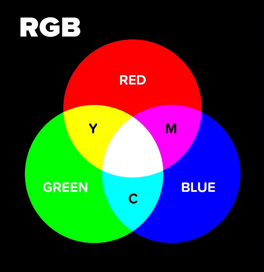
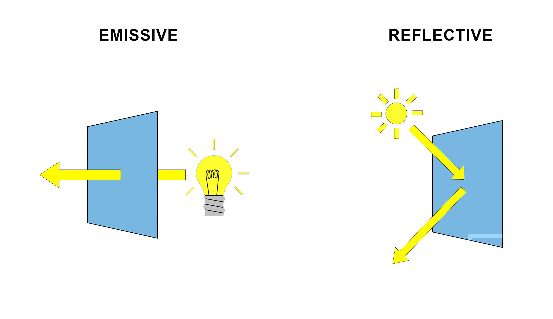
RGB (red, green, blue) is the language of light - it is additive and emissive. It is used in things like computer screens.
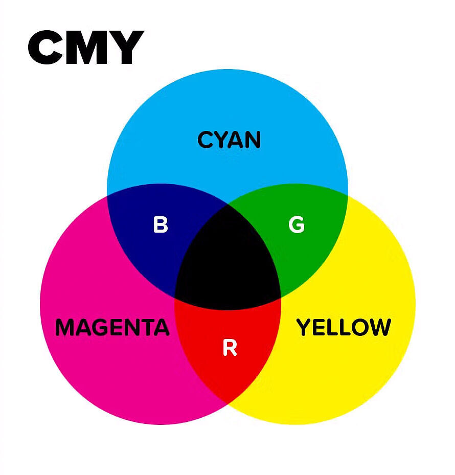
CMY (cyan, magenta, yellow) is the language of ink - it is subtractive and reflective. It is used in physical printed things.
Expanding on earlier:
When talking about RGB being an additive colour model, we are saying that it starts with darkness (black) and adds red light, green light and blue light to create a spectrum of colour. Add enough of each, and in roughly equal parts, and you get pure white. Add differing amounts of each and you get the spectrum of all possible colours.
The overlapping of two additive primary colours (red, green, blue) will result in one of the subtractive primary colours (cyan, magenta or yellow).
eg. a 50:50 mix of Red and Green light gives Yellow, 50:50 Red and Blue gives Magenta, and 50:50 Green and Blue gives Cyan.
CMY on the other hand is a subtractive colour model. That is, the combination of Cyan, Magenta and Yellow will ultimately result in black. We are using these colours to subtract reflectivity away from pure white (i.e. paper) to create a spectrum of colour.
The overlapping of two subtractive primary colours (cyan, magenta, yellow) will result in one of additive primary colours (red, green and blue).
eg. lay down a 50:50 mix of Cyan and Yellow ink and you will end up with Green.
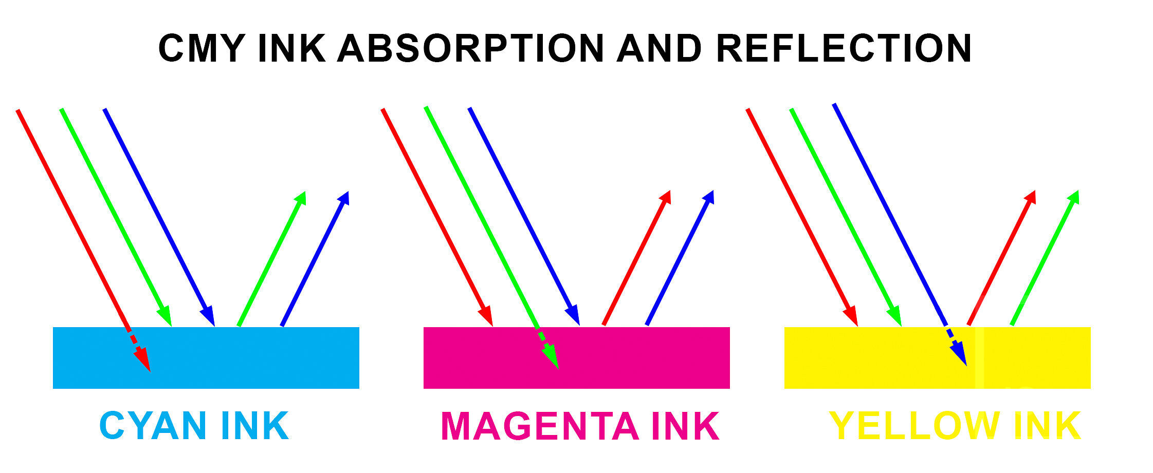
In terms of ink, when a piece of paper is getting hit with white light (containing all wavelengths):
Cyan ink absorbs the red wavelengths of light and reflects green and blue light. Our brain broadly interprets a combination of green and blue wavelengths as being cyan.
Magenta ink absorbs the green wavelengths of light and reflects red and blue light. Our brain broadly interprets a combination of red and blue wavelengths as being magenta.
Yellow ink absorbs the blue wavelengths of light and reflects red and green light. Our brain broadly interprets a combination of red and green wavelengths as being yellow.
As you can see, Additive and Subtractive models are not disparate, quite the opposite - they are intrinsically interlinked.
Another fundamental difference of RGB vs CMY is that RGB is emissive, while CMY is reflective.
We have already touched on this earlier, but think of the RGB of a computer screen, it starts with black and emits light out of itself (hence emissive). In light systems, you get more saturation by adding more light together, so your saturated colours tend to be at the higher end of the brightness scale.
By contrast, CMY is reflective - we are starting with pure white being reflected off a piece of paper, and subtracting certain wavelengths away from pure white using ink to give colours. With ink systems, you make more saturation by adding more ink (and therefore subtracting from the paper’s reflectivity) - so you tend to get your more saturated colours at the lower end of the brightness scale.
As you will have seen by now, the way that screens and prints construct colour is totally different to one another.
Because of this, the environmental lighting conditions that are necessary for the accurate perception of a monitor’s emmisively constructed colours is totally different than the lighting conditions necessary for the critical analysis of a prints reflectively constructed colours. It is impossible for them to coexist in the same space under the same lighting conditions and not perceptually invalidate each other in some way.
This is the reason behind why comparing the results of these differing models directly side-by-side is fundamentally flawed and wrong, and why holding prints up next to a monitor in order to compare them just does not work.
The physics of light just does not allow for a perceptually reliable direct comparison under shared viewing conditions.
The question now becomes, how am I supposed to compare my prints to my screen then?
The answer - counterintuitively - is that you need to look at your monitor and prints independently.
Because it is not possible to view both print and screen directly together under the same lighting conditions, as they construct colour totally differently (plus sources are rarely spectrally identical). This necessitates viewing each one independently, under independently controlled lighting conditions, and allowing our eye’s natural chromatic adaptation to compensate for these inherent differences.
This is actually a good thing, as independently controlling a screen’s and print’s lighting conditions allow us to effectively compensate for their differing ways of constructing colour, and ultimately allow us a closer comparison than if they were together!
First we’ll cover monitor and environmental light control, than we’ll cover print viewing/analysis lighting.
Monitor Light Control is a two-piece story, only half of which actually directly involves the monitor! Not only are the characteristics of a monitors light itself important, but the characteristics of the light in the environment that the monitor is placed in is an equally important aspect to consider and control for accurate viewing. They both go hand in hand. It doesn’t matter if your monitor is perfectly calibrated if you then put it outside in direct daylight. The environmental lighting conditions around your monitor impact your perception of the monitors colours as much as, if not more so, than the characteristics of the monitors light itself. If either aspect is deficient it will invalidate the accuracy of your calibration and the accuracy of your perception of colour overall.
Monitor Calibration is the most common way of controlling the characteristics of a monitor’s light in order to more closely match/mimic a printed paper result.
We have talked about this a lot in various articles across our site, and it’s very hard to overstate the importance of correctly calibrating your monitor (particularly for print).
This allows you to control things like: luminance (brightness), white point (temperature), contrast ratio/black point (to mimic the comparatively limited contrast ratio of paper), gamma and gamut.
Officially the figures for correct calibration according to purpose are specified by the International Organization for Standardization (ISO), who make two applicable standards that cover what we are about to talk about: ISO3664 and ISO12646.
In plain language:
Technically, in the context of comparing screen to print matching we ideally want our monitor calibrated according to ISO12646, and our room lighting and print viewing lighting setup according to ISO3664. This is the (theoretically) ideal set of standardised settings and parameters to (theoretically) provide the best match from screen to print.
At this point it is worth noting that the following recommendations represent a pragmatic departure from strict ISO definitions. While ISO standards specify reference conditions, they do not account for many real-world constraints or perceptual factors. The choices outlined here are intended to improve practical screen-to-print consistency under typical working conditions, and should be understood as perceptual compromises rather than colourimetric absolutes.
The practical limitation is that these standards do not explicitly account for several common real-world constraints, namely; the mixed daylight/artificial lighting situations that most real-world workspaces exhibit (5800k can often better perceptually align with the 'new' average 'non-ideal' viewing environment); optical brightening agent (OBA) content causing a cool shift when fluoresced by UV in said environment; your eye's chromatic adaptation/colour constancy mechanisms; metameric mismatching/spectral discrepancies across light sources; and a monitor’s diminishing spectral response characteristics as they move further away from their native whitepoints.
So, our actual practical recommendations for monitor calibration settings deviate slightly from the ISO standard - this is not a mistake.
Through much testing and years of hands on experience, we have found that the following set of settings to give best results for the majority of situations and a majority of people:
A brief explanation of reasoning behind these particular settings below:
Side note: for a look into the early ‘fight’ that was the adoption of D50 vs D65 as standards, see this article.
Environmental Lighting Conditions (ambient or room lighting) are equally important in ensuring the perception of your monitor’s colour is accurate.
The lighting characteristics necessary for accurately viewing prints in order to evaluate a match from screen to print are covered in ISO3664. Specifically the P2 condition is what we are after, but I will include the figures for P1 as well for reference.
P1 - Critical Evaluation of Prints. This condition is used for comparison between two prints, or between physical original and printed reproduction. Is it not suitable for print to screen matching, as it is far too bright. For reference, P1 specifies D50 (5000k), 2000lx +/- 500lx (should be +/- 250lx), CRI >90, uniformity >0.75, and surrounding environmental luminous reflectance <60% (neutral and matt). Most colour management systems are built around these conditions (D50 2000lx).
P2 - Practical Appraisal of Prints. This is the condition used for comparison of a print to an ISO12646 calibrated monitor that is within ISO3664 environmental lighting conditions. It specifies D50 (5000k), 500lx +/- 125lx, CRI >90, uniformity >0.75, and surrounding environmental luminous reflectance <60% (neutral and matt).
You of course will need a light that fits the above requirements - you want consistent and accurate colour temperature settings, variably stepped brightness adjustment, and a high Colour Rendering Index. I’ll discuss options that fit these specifications just down below.
So, why 500lx for P2?
Well, if you take an average sheet of neutral white fine art type paper and view it under 500lx illumination, it will give a very close visual match to a monitor’s brightness of 80-90cd.
500lx is also a very good average figure for the light level in a typical Australian room during daytime.
Obviously lighting levels within buildings do vary greatly - while a typical room might be around 500lx, a room with many large windows can be up to 2000lx, while at night, under artificial light, might be as low as 200lx.
Exhibitions, galleries and photographic competition judging are also generally significantly above 500lx (ISO3664 recommends P1 conditions for judging and exhibiting of photographs - 2000lx +/- 500lx).
And that’s just discussing brightness, let alone temperature or colour rendering index either!
Unfortunately, when viewing prints, there is no one standard for brightness (and temperature), and obviously you can’t really control the final environment your prints will end up in (unless it is your own home), so the best approach for most people is to print for a reasonable average and accept that this is fundamentally out of your control. Hence the 500lx average.
A proper print viewing booth (from the likes of GTI) is slick, professional, easy....and unfortunately really not cheap. They can also be very bulky, and usually quite unattractive too - not great for a nice, stylish home or small studio.
An easier and significantly cheaper approach is to use an existing lamp option, rather than an expensive print viewing booth. If you choose the right lamp, this offers sufficient accuracy for almost all normal print viewing tasks.
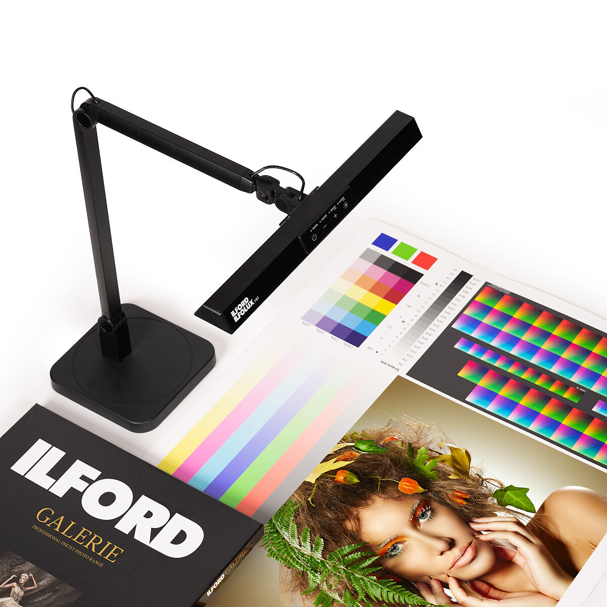
You do really need a dedicated good quality light source though, so no cheap/low-quality spectrally-peaky home-grade bulbs. You want consistent and accurate colour temperature settings, brightness adjustment, high-CRI/high-RA.
There have been many different lamp options over the years that can fit this bill (Solux, GTI, Fiilex, GrafiLite, Just-Normlicht, etc), but since its release in 2023, the clear favourite in this category is the Ilford Ilfolux. It's very affordable in the grand scheme of these sorts of lights, works extremely well, and has excellent, easy to use controls. It comes with a table stand, but also includes a clamp. A single lamp accurately and comfortably lights an A3 or so area, so you might even want to consider getting a couple of these if you are the typical home studio A2 printer owner.
So, following all of the above…
Now, you may be thinking, that since we have calibrated our monitor to 5800k, but our print viewing light source is 5000k, that they could not possibly match!
Let me introduce you to Chromatic Adaptation.
Chromatic adaptation is broadly defined as the ability of the human visual system to discount the colour (temperature) of the illumination and to approximately preserve the appearance of an object under a wide range of light sources.
Jeremy explains it extremely well in his book:
The human eye is an automatic adaptor - this is great for us, as it means when we move from different contexts (say indoors under warm interior lights to outdoors under cool blue sky) - we don’t experience massive and jarring colour shifts as the colour of light changes - indeed, we basically don’t perceive the colour of light changing at all unless its a very significant shift. However, devices like cameras do not automatically adapt in the same way.
For example, look at a green apple outside, under bright midday sun - it predictably looks green. If we wait several hours and look at the same apple again at sunset, the apple still looks green, despite the light now being much, much warmer. Based on the colour shift of surrounding objects and environment, the brain quite effectively compensates for the effects of differing lighting scenarios and interprets objects as a roughly stable colour under varying illumination conditions. This is knows as colour constancy.
What this means for us, is because it is not possible to view both print and screen directly together under the same lighting conditions (as each one requires differing lighting conditions for most accurate and optimal viewing), we can in fact safely view each one independently, under independently controlled lighting conditions, and despite having different whitepoints, by allowing our eye’s natural chromatic adaptation to compensate for these slight inherent temperature differences, we can ultimately end up at a result that allows for an overall more accurate comparison than if we were to do it directly side by side.
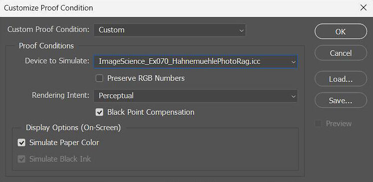
One last point to discuss that can help get you the last 5% of the way there to as close of a screen to print match as is possible is that of Soft Proofing.
Soft proofing in Photoshop can be very precise and quite effective, but it does take some time to get familiar with the process and use to it. A good understanding of what it is trying to show you is also an essential part to getting the most from it.
We have two articles that discuss soft proofing that are worth a read:
Advanced Soft Proofing with Eizo ColorEdge Monitors
In essence, soft proofing uses a custom ICC printer profile (which very accurately characterises the qualities and response of a certain paper on your exact printer) to give you a colour accurate on-screen proof of how your image will look once printed. It is designed to show you what changes the printing process will cause to your image.
There are multiple levels to soft proofing:
Basic soft proofing just shows you basic colour shifts that will be introduced when printing your image on a certain paper, plus any out of gamut colours (if enabled). This tends to be the most perceptually accurate form of soft proofing (giving your the best overall impression).
However, there is also a slightly more advanced form of soft proofing will show you base paper tone, colour shifts, precise contrast changes, out of gamut colours, black ink density/tonality and the effect of different rendering intents. To an untrained and inexperienced eye advanced soft proofing can be quite a shock, as the sudden drop in contrast in particular can cause a bit of confusion. This is a technically more accurate process, but a less perceptually accurate one. Useful for checking shadow and highlight details levels though.
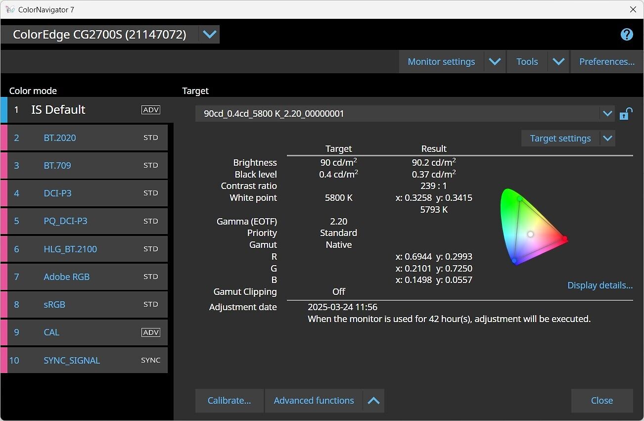
Alternatively if you have a good quality hardware-calibratable monitor such as an Eizo CG/CS you can load a custom printer profile in to define the gamut target of your particular paper and printer combination at the hardware level for the most accurate results. This is a form of advanced soft proofing in hardware.
That’s really all you need to know. Follow the techniques and specifications above and you will be in the best situation possible to accurately compare prints to your monitor.
If you want to get a bit more in depth technically continue reading, but also feel free to stop reading here, as the below isn’t essential unless you want a deeper level understanding.
Read on if you want to understand more about emission spectra and black body radiators, human vision and metamerism, and how monitor backlighting technologies compare.
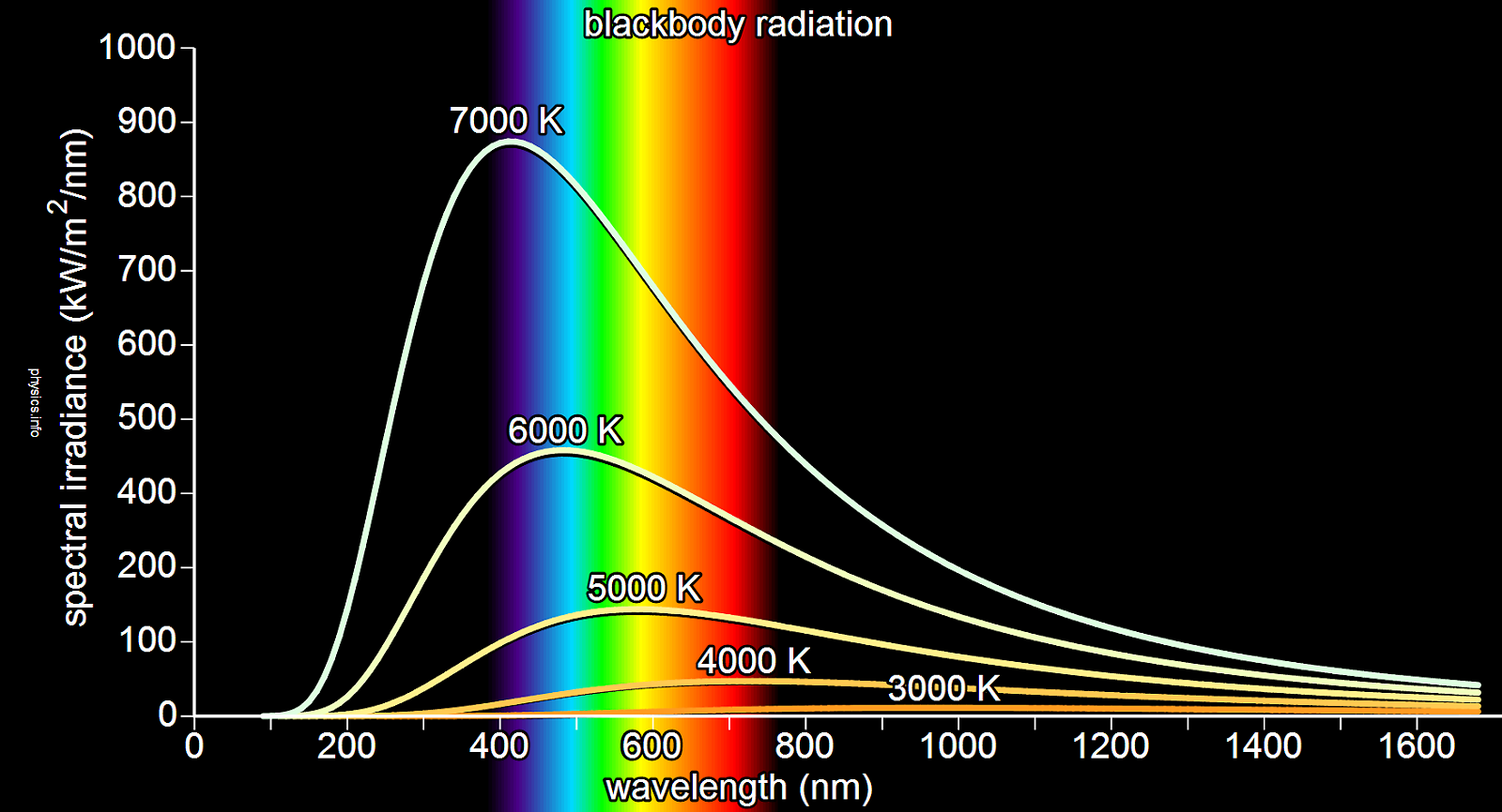
The ‘ideal’ emission spectra of the ‘perfect’ light source would be that of a black body radiator (at a defined temperature). While the true definition is quite complex, for our purposes, black body radiators have a continuous/even spectrum of emission/power distribution - that is, they give off light at all wavelengths, without major deficiencies or peaks (other than the primary one related to their temperature).
One of the most familiar/common light sources that closely approximates a black body radiator is the humble incandescent filament lamp. Because they emit light by (electrically) heating a metallic element until it glows they emit quite an even distribution of spectral power, one without many deficiencies or peaks. However, as their emission of light is tied to their heating, practically varying the temperature of the bulb is very difficult for most practical purposes as you run into physical limitations of the materials. They are also extremely inefficient - converting less than 5% (sometimes as low as 2%) of their input power into light, the rest being mainly lost as heat! They also have quite short lifespans, and take time to ‘warm up’. Not ideal characteristics for a monitor backlight!
Normal human vision is trichromatic, that is, having only three colour receptors. The three types of cone cells - Short, Medium, and Long - are each most sensitive to different wavelengths of light: Short around 420–440nm (peaking at 420nm), Medium around 534–545nm (peaking at 530nm), and Long around 564–580nm (peaking at 560nm). Their sensitivity to each wavelength of light decreases the further away from each of their respective peaks the wavelength gets.
These can be broadly characterised as Blue, Bluish-Green, and Yellowish-Green respectively, often reductively summarised as Blue, Green and Red respectively.
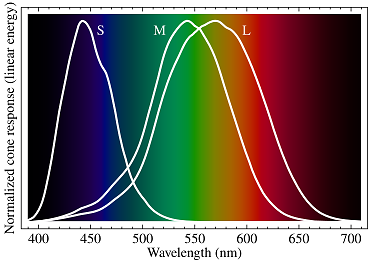
In normal vision, a range of wavelengths of light stimulate each of the three receptors to varying degrees. The brain combines this differential stimulus information from each type of receptor to give the perception of colour.
Cone cells (particularly Medium and Long) are almost never fully independently activated. More than one cone is almost always activated to some degree alongside with another.
For example, when viewing what we would call the colour ‘yellow’, the combination of wavelengths that produce the sensation of ‘yellow’ are activating the Medium (Green) and Long (Red) cones simultaneously, while basically not stimulating the Short (Blue) cones at all.
Very broadly speaking:
| Wavelength | Perceived Colour | Cone Cell Activation |
| 400 nm | Violet | Short and Long |
| 450 nm | Blue | Short |
| 480 nm | Cyan | Short and Medium |
| 530 nm | Green | Medium |
| 580 nm | Yellow | Medium and Long |
| 650 nm | Red | Long |
A note on the above: Medium (Green) cones physically cannot be activated completely on their own. If a Medium (Green) cone was independently activated, with no stimulation of the other two cones at all, then an impossible ‘hyper-green’ colour would be perceived. This is not only impossible, but impossible to comprehend or describe.
Following on with another example in regards to sensitivity, Short cones have an approximate relative sensitivity of about 60% for 466nm light - think of this as every 6 out of every 10 photons of 466nm light hitting the eye as being absorbed.
This sensitivity drops to around 30% for 479nm light - think of this as every 3 out of every 10 photons of 479nm light hitting the eye getting absorbed.
This means that a 479nm source would have to be twice as bright (providing double the amount of photons) as a 466nm light source in order to generate the same level of stimulation and same response on the eye.
Think of this as, if you shined a 466nm light with an arbitrary intensity of ‘10’ (60% of 10 = 0.6) on a Short cone, this is the exact same level of stimulation as shining a 479nm light source with an intensity of ‘20’ (30% of 20 = 0.6).
The Short cones by themselves cannot distinguish between these two above light sources as they are providing the same level of stimulation - these two theoretical sources are metamers (more on this later). Any single cone cell by itself can confuse any two light sources as long as the intensity of each matches the sensitivity at each wavelength.
Practically this means that all ‘colours’ are essentially reduced down to three sensory quantities, or ‘channel intensities’ if you will (commonly numerically represented as tristimulus values) of the degree to which each cone cell is stimulated. Because each type of cone cell is responding to the cumulative energy from a broad range of wavelengths, different combinations of wavelengths can produce an equivalent receptor response (and the same tristimulus values or ‘colour sensation’) even though they are being stimulated by spectrally differing light sources.
This leads us nicely into the issue of Metamerism (or more specifically Metameric Failure).
The true definition of metamerism (and metameric failure) is ridiculously complicated, but I will give a brief summary of key points and factors here.
As just previously discussed, the human vision system reduces the spectra of light hitting the eye down into just three ‘coordinates’, because of this, there are a near-infinite number of spectra that can produce ‘colours’ that look the same to us.
Spectra that resolve to the same colour in human vision systems are called metamers.
A Metameric Match occurs when two colour samples, being illuminated by two light sources with different spectra are perceived as the same colour.
Metameric Failure is the opposite of this - two colour samples that appear to match when viewed under one light source, can then not match when viewed under a different light source with a different spectra (despite our eye’s chromatic adaptation saying that they are equally ‘white’).
Put plainly, in practice it’s the phenomenon whereby something you view changes colour unpredictably under different light sources that contain a different mix of wavelengths of light.
What this means for us in a practical printing sense, is say you can achieve nice, neutral greys out of an inkjet printer (or so you think) when viewed under a high quality print viewing lamp. Take your nice neutral great print outside and it suddenly changes colour, taking on a unpleasant cyan or magenta cast. This is fundamentally an unsolvable problem without pretty fundamentally changing the composition of your inks, which of course not many printers have the luxury of being able to do. We therefore have to work within these constraints, as we have no choice.
Broadly speaking, in our domain there are two predominant monitor backlighting technologies that are in wide use. The older and now less common Cold Cathode Fluorescent Lamp (CCFL) and the newer and more common Light Emitting Diode (LED).
Technically there are several more backlight technologies, and even further subsets of each, but the most common are:
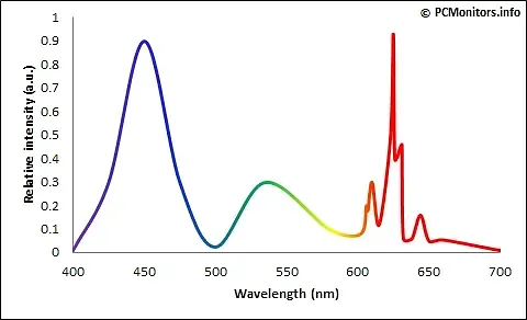
I’m not going to go into CCFL too much, as they really basically stopped being produced around 2010 and are reasonably rare these days. They are fundamentally a phosphor based technology (similar to fluorescent tubes), and they miss several wavelengths of light which makes them less than ideal.
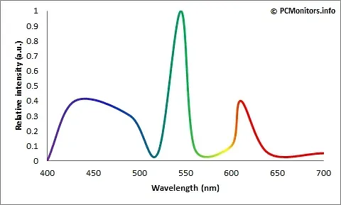
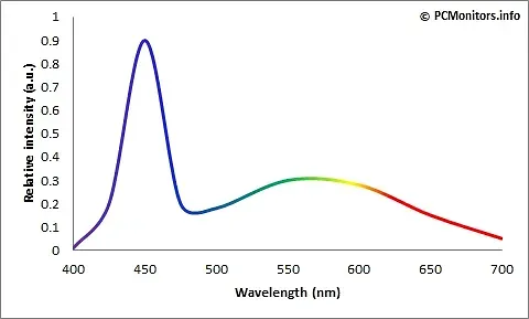
White LEDs are used in nearly all standard ‘LED’ monitors currently. However, despite the name, ‘White’ LED's are actually blue LEDs with a yellow phosphor layer over the top to transform (or convert) some of the (blue) light to the Red and Green primaries necessary to create the illusion of white light. They still have a large component (peak) of blue light mixed in. Do note that it is not true white light, it merely gives the impression of it. If you actually look at the spectral curves for ‘White’ LEDs they are quite ‘peaky’ (with the aforementioned strong blue peak, and a more broad yellow/red region) compared to sunlight for instance. This ‘white’ light is then filtered through the individual Red, Green and Blue filters within the LCD panel to give a spectrum of colour (and refinement of the whitepoint away from native - more on this later).
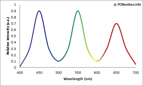
RGB LED - which is a lot less common in our domain, uses three individual LEDs to emit one of each of the primary colours (red, green, blue), and them mix them together to form white light. On the surface, this approach appears to remedy the above White LEDs pitfalls (and give wider gamuts), however, because this mixing needs quite complicated electronic circuits to control the blending of each of the colours, it is rather difficult to produce a perfect ‘neutral’ white of a stable colour temperature (individual diodes degrade at different rates over time - resulting in colour imbalances). Furthermore, because different coloured LEDs have different spectral power distribution, the colour balance can actually change depending on your viewing angle (yes, even if the three diodes are in a single package). And again, as the resultant ‘white’ light is a combination of three individual base sources which are themselves constructing their primary colours in different ways within the diode package, they tend to be quite peaky also. In short, they are expensive to produce, larger, heavier and with greater power consumption.
GB-LED (or GB-r LED) is short for Green-Blue LED. Rather than using a blue diode coated in yellow phosphor, this technology combines individual blue and green diodes with a red phosphor layer. This creates strong and distinct spectral peaks for blue, green and red rather than giving a blue peak and broad yellow/red region as in the White LED. Again, it’s very peaky - the classic triple peak in fact.
PFS-Phosphor - Similar to White LED, this adds a narrower band red phosphor called potassium fluorosilicate (PFS) alongside other phosphors (eg. Ce:YAG) to assist in additional red light generation. As blue light passes through both the phosphors, the more traditional eg. Ce:YAG phosphor converts blue light to green and red/yellow light as in the White LED, and the additional PFS phosphor converts blue light to extra narrower-band red light. Because of this the colour temperature can be more easily controlled by changing the concentration/mix of each type of phosphor during manufacturing.
Whatever the resultant emission spectrum of whichever technology we are using to create ‘white’ light, this light will essentially have a ‘hardcoded’ colour temperature that is inherent to the design of that specific diode package. This is what we call the Native Whitepoint of a monitor - the natural, ‘default’ colour temperature of the backlight before it gets filtered through the panel. In the vast majority of cases this is designed to be around 6500k (D65) - the standard ISO3664 temperature for screen based work.
However the approximation of white light is being constructed, it then has to be filtered through the individual Red, Green and Blue sub-pixel filters within the LCD panel to give a spectrum of colour (and refinement of the whitepoint away from the native whitepoint). This LCD panel filtering reduces the initial spectral energy of the backlight considerably (energy is lost as the LCD blocks light), and because this filtering process is an imperfect one (no sharp pass/attenuation properties, think ‘colour crosstalk’), the spectral imbalance of the backlight is still an underlying issue. A typical White LED panel makes good use of the very blue heavy spectral emissions (from the underlying blue diode base). The red and green components are comparatively relatively weak (having come from the phosphor coating), so these are comparatively ‘harder’ colours to generate.
Operating a monitor at it’s native whitepoint ensures maximum accuracy and performance (and stability and consistency), as minimal LCD panel filter needs to take place, but as we’ve already discussed, this native 6500k is not optimum for printing. The further away from native the temperature a monitor has to be pushed (the more filtered/refined by the LCD panel), the less spectrally accurate it becomes. Because it has a strong blue component, the warmer we push the monitor, the more filtering has to occur, and the more we are relying on the (weaker) phosphor generating component to generate the wavelengths of light we need to create these warmer tones.
Ergo, the further away from D65 you get, the less accurate spectrally a monitor gets. For a lot of monitors 5000k is just too far, filtering too many wavelengths of light. 5800k is a middle ground figure, a compromise if you will, that is an appropriate balance of warming up from D65 towards D50, but not going as far as D50 where things can get messy.
A final note on standards, perception, and pragmatic deviation
The ISO standards referenced in this article define idealised, tightly controlled viewing and measurement conditions. They provide a critical colourimetric reference framework, not a guarantee of perceptual equivalence in all real-world environments.
In practice, many working photographers and printers operate in mixed-lighting spaces and non-laboratory conditions. Some of the recommendations discussed here therefore represent deliberate, informed deviations from strict ISO compliance, intended to improve perceptual consistency rather than to achieve formal neutrality.
These approaches rely on the adaptive behaviour of human vision and are sensitive to context, observer variability, and lighting conditions. They should not be interpreted as universally correct, nor as substitutes for a proper understanding of the underlying standards and colour science.