Calibrite ColorChecker Classic
The original 24 patch, A4 sized target for colour control from capture to edit.
▪ Free Shipping - this product ships free!Please note that we are open by appointment only (except for click and collect pickups once notified ready).
For most people, 'basic calibration', with sensible settings, as we cover in our Eizo ColorNavigator 7 Calibration Guide, is enough - it allows them to achieve excellent accuracy without having to get too deep 'into the weeds' with the finer points of colour management.
But, as ever with colour, there's always another level. Eizo provides high quality, easy to use tools to make the screen to print match even more precise - so if you're looking for the best possible match between your screen and your prints, this is how to achieve it. We believe this is literally the best possible approach to print accuracy available in the world today.
(Of course alongside these techniques you will of course also need an excellent, accurate custom ICC profile, for your printer/media combination!)
Advanced Soft-Proofing with Eizo ColorEdge monitors is the pinnacle of pin point accurate soft proofing. It's the best available means to achieving the ultimate match between screen and print.
Having said that - for most people, realistically, it's probably not necessary, or even necessarily desirable. Instead, it's a technical process for quite specific, tightly controlled situations.
Most people will simply want to calibrate to sensible settings for general fine art printing, per our general guide to Calibrating Eizo ColorEdge Monitors with ColorNavigator 7, and at that point they will already be achieving excellent, accurate results and screen to print matching, without getting too bogged down into very specific things tailored to only one specific circumstance. Compared to the, frankly, garbage that Adobe calls soft-proofing in Photoshop and Lightroom, there is simply no comparison to hardware based soft proofing, even with a 'basic' calibration as per our regular guide. Software based soft proofing just does not work, and is generally a hindrance rather than a help. Anyone who has moved to an Eizo ColorEdge (or BenQ SW) level monitor soon sees the advantages of hardware based proofing.
We certainly recommend that's where you start, and historically speaking at least 80% of people will find they're very happy with their colour accuracy at this point, and they don't need to go any further 'into the weeds' with colour management for their day to day work. And there is a danger to too much specificity with colour - the more you tend to target one specific thing - e.g. one specific media output from one specific printer - the more you move away from more general solutions. Even for my own personal work - where I am working on images for mostly unknown purposes (some will be displayed on OLED screens, some on phones, a few might be printed etc. etc.) - I do not normally work in the way I describe below, as I am rarely aiming for something so specific. But when I do need this level of specificity, it is remarkably effective, and so far ahead of e.g. Adobe soft-proofing, it's like comparing a paper plane to a Space Shuttle.
When you do want to do that specific thing - i.e. match your screen to a particular printed output (and even further, under specific lighting) - then this method for Advanced Soft Proofing simply creates the best visual match I've ever seen. This process makes your monitor a near perfect predictor of your final output.
The process starts with a standard calibration.
You can begin with a standard calibration that follows our suggested settings, or more likely you will probably start with something like an ISO 12646 standard calibration.
The most noticeable difference will likely be the whitepoint - for general purposes, we recommend 5800K as a good starting point for most imaging work. But if you're seeking to match a print, as produced using an ICC profile, that profile will almost certainly have been built for 5000K lighting. More than likely, in this scenario, you'll also be using a print viewing light - something relatively like the new Ilfolux light, or a BenQ WiT lamp, or you're lucky enough to own a proper print viewing booth from GTI/Just Normlicht etc. Typically, these would be set to 5000K as well, unless you're e.g. trying to target print display under specific, measured, actual conditions.
An even more specific scenario might be if you have visited your exhibition space, and measured the actual lighting. This might be, say, 4400K in practice - in which case, you'd set your print viewing booth to this (this is beyond the capabilities of the simpler print viewing lights, of course!) - and would likely also build (or have built) a custom ICC profiles for these same conditions. (All that is possible, of course, if you want to go to that level - but we won't deny that it is rarely done in practise!).
Once you have completed your base calibration to a sensible starting point, the next stage is to use Eizo's Manual Adjustment tools to further tweak the calibration to the point of best accuracy.
These tools are accesses via the Advanced Functions menu:

The adjustments we're about to do will be visual. At the end of the process, ColorNavigator will re-run its adjustments based on the changes we've made.
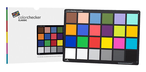
You'll want to have ready some blanks of the paper you're trying to match, displayed under your print viewing lights. You'll also likely want to have a ColorChecker or similar colour target handy.
We're going to adjust the most fundamental aspect of matching - the whitepoint - by visually tweaking our calibration such that our image editing application, displaying an empty white image, best matches the paper's whitepoint, as viewed under our print viewing lights.
Set up your screen like this, and enter the Advanced Functions - Manual Adjustment area:
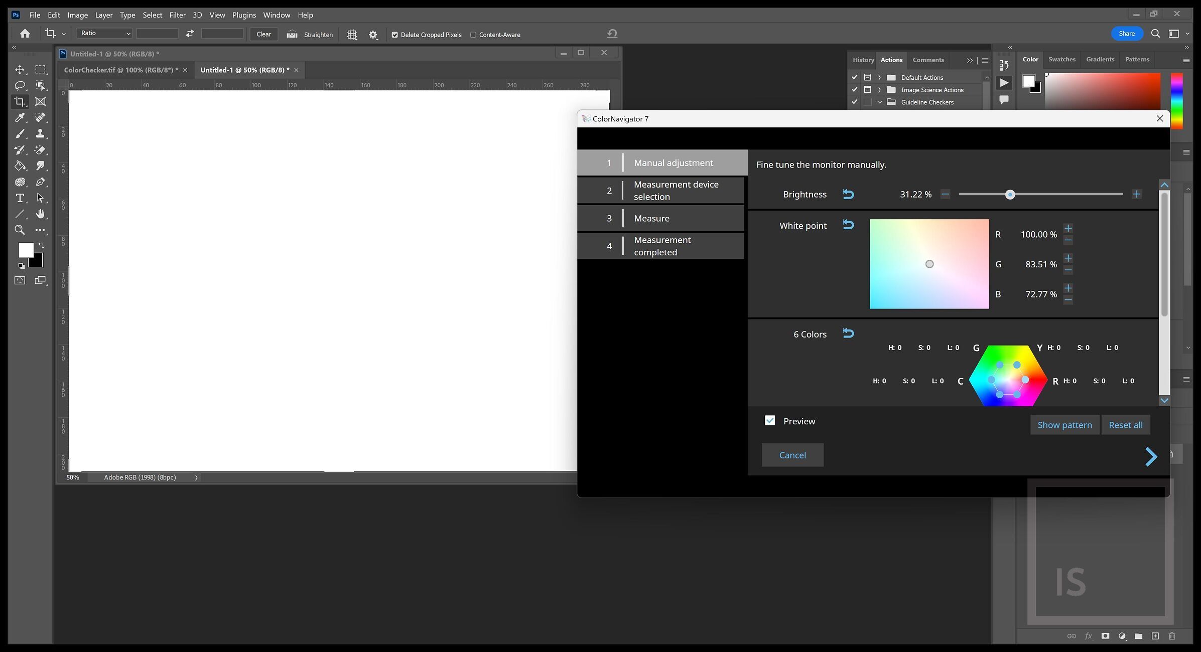
The controls to use at this point are the brightness control, and the whitepoint. Adjust these, by eye, for the best visual match.
I sometimes like to get some other eyes on things at this point, just to be sure I'm seeing what I think I'm seeing. And I like to leave this open, go away for a few minutes, then come back to it, just to confirm the match is really at its best. Eyes are tricky things and fresh eyes tend to make the best judgements!
You can work backwards from a print of a specific reference
image, but that risks bias due to that particular image's
characteristics. Most commonly this is done with a physical colour
target, like the class ColorChecker, and with your monitor displaying a
digital image of the same colour target.
Again, view your colour target under your print viewing light.
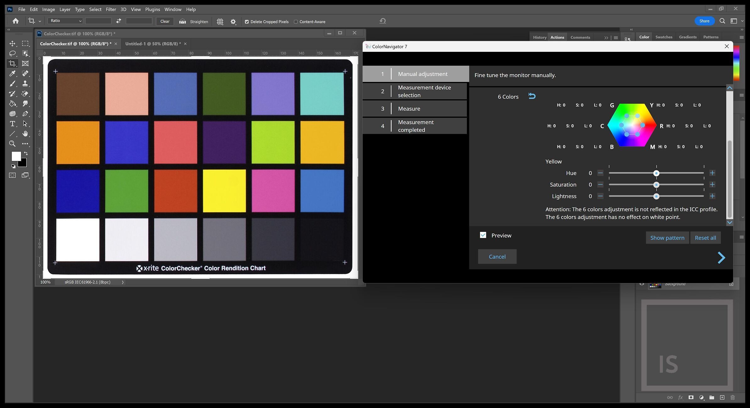
For this stage, we use the 6 axis colour correction tools.
You can click on each of the colour points - representing Red, Green, Blue additive primaries and the Cyan, Yellow, Magenta subtractive primaries.
For each, you can manually tweak the Hue (colour), Saturation (intensity), and Lightness (brightness). You do so visually, comparing the on-screen representation against your physical target, to improve the match.
(To do this, it helps tremendously if you have a solid understanding of digital colour models - which I cover extensively in my (free!) Fundamentals of Digital book).
(Please note you will only be able to adjust the black point and Gamma (EOTF) if you choose 'Fixed Gamma' priority in your original calibration target settings).
The 'Black Level' and 'Gamma {EOTF)' adjustments can be used to further improve the overall density/contrast, and especially deeper shadow level, matching.
For this, I usually use a simple levels print that I have made (and printed with my custom ICC profile) - with patches covering 5% steps from 100% white down the tonal scale to 10%, then single percent steps from 9%, 8% ... to 1%, and from 91%, 92%...99%.
There are many such images available on the web.
Once you have achieved the best possible match between both your paper's white, and the tones of your colour target, use the right arrow to proceed to the next stage. This will follow then normal path of a standard calibration, i.e. selecting a measurement device, and then the monitor will complete its adjustments.
Give your result a sensible name - typically we'd use something like 'ASF Hahnemuehle Bamboo, 5000K' (where ASF stands for Advanced Soft Proof, and is used to distinguish this more specific target from our 'regular' calibrations).
And that's it! Assuming (of course) you are printing with an accurate, custom ICC profile made specifically for your printer and paper combination (or, your printing service is!) - you should now have achieved the ultimate in screen to print matching!