▪ N.B. Please visit the full listing for important info on some variants.
Please note that we are open by appointment only (except for click and collect pickups once notified ready).
High quality lighting for colour assessment and print viewing is an essential part of a colour managed workflow - yet almost nobody has one!
This articles explains why you need one, and shows off the great new option, the Ilford Ilfolux.
(If you already know why a print viewing light is important, you can just jump down to our mini-review of the Ilford Ilfolux).
For most people, the last big missing step in their colour management chain is a decent print viewing light.
It's long since established that for high quality, consistent imaging work you need a high quality monitor, and you must calibrate that monitor.
If you haven't yet solved that problem, then stop reading now and
attend to that first - no other change you make to your workflow will
affect things as much as having an excellent, calibrated monitor - if
you can't accurately see what you've got and what you're doing, then you
can't do high quality work - it really is that simple.
If you're printing for yourself, of course you also need a high quality printer. Then, you have the full loop in-house -
from capture/creation - through editing and file preparation - to final
print.
But whether you do your own printing, or you use a high quality print service, you need to be able to really see your prints - that is,
look at them under correct lighting - to know just how well your screen to print matching is really working.
Sure, you can just look at your prints under interior lighting, or in window light - but you then have to accept that the light you're using is having a quite significant effect on your perception of the print. 'Standard' lighting is anything but - indoor lights have colour temperatures that are all over the place - from 5000K plus cold LED lighting through to very warm, 2000 to 3000K indoor lighting. And beyond just the whitepoint, the colour rendering can be all over the place. Some lights significantly over-or-under emphasis various colours, so you're just not going to be seeing your prints correctly - in the colour management sense, anyway!
This is acceptable, and fine - if you're printing for that specific context and you know you're only ever going to look at your prints in that exact lighting. But that's almost never the case - you might be making prints for an exhibition, or for someone else's walls. Or you might be making prints for Photographic Club competition.
Much as with monitors - how can you do your best work if you can't really, accurately, see what it is that you're actually producing?
There are really two ways of looking at an ideal light for print viewing - two contexts in which they are commonly used.
The first context is as a General Purpose Light for print viewing and assessment. Necessarily, this light needs to be a 5000K light, and to render colour across the visible spectrum consistently and accurately.
The 5000K is because all of colour management for print and photography is built around 5000K light as the standard light source. 5000K is used as it reflects a mid point between typical indoor and outdoor light. Custom ICC Print Profiles are, almost always and by default, built to make colour render accurately, when viewed under a D50/5000K light source.
So, if you're assessing a screen to print match, then you must really look at your prints under such a light source - that is, the light must have an easily and consistently available setting for a 5000K colour temperature output.
(Interestingly, other domains vary - e.g. in textiles, the standard light has a white-point of 6500K - as for e.g. sports uniforms etc, colour assessment in outdoor light is the key issue).
The second context is using a print viewing light as a much more precise predictor of a specific final viewing scenario. For example, you might be planning an exhibition, and you've measured the lighting in the exhibition space as having a white-point around 3200K. You could then improve your targeting of this particular exhibition space by having a custom printer profile made, tuned for this specific lighting (it's possible to even measure the full spectral output of a light and integrate this information into ICC profile construction).
Then, during your preparation stages, you would then want to be able to look at your test prints under the same, or very similar, lighting. For this purpose, then, you would then probably want other common white-points available - with ideally 3000K → 6500K available to cover all common scenarios.
There are other things you might want from a print viewing light:
For years (probably even decades, at this point!), I have been asking/begging suppliers to produce a print viewing light that has all, or almost all, of the above attributes, and plugs this very obvious gap in the colour management workflow that most still suffer from. To me, it has long seemed such an obviously useful device, and not that hard a problem to solve.
In reality, I probably had to wait for the golden age of LEDs that we now find ourselves in - LEDs have, in recent years, leaped forward in terms of their colour rendering qualities.
At last, someone - the ever innovative Ilford - has finally listened, and we have just received our first demo unit of the brand new Ilford Ilfolux. We've been trying it out for the last couple of weeks here at Image Science. Stock will start shipping mid to late April, all going to plan (and you should consider making a pre-order now, if you have an interest - as Ilford tell us the first stock is selling quickly!).
The Ilford Ilfolux is very close to the ideal print viewing light. Here are the key features:
N.B. Note the actual USB power adaptor is not supplied, you will need to add USB power supply 'wall-wart' (5V, 2A) - but of course most folks have several of these just lying about by now (e.g. just about any old phone charger will do - but do check carefully that your power supply can supply 5V 2A - you should never use an under-rated power supply with a USB device, as this can pose a fire hazard!).
Ilford tell us this is left out so they can avoid having to get electrical certification in every market, and indeed we're seeing more and more USB powered gadgets appearing for precisely this reason - it means they can be brought to market much more quickly and cheaply.
The IlfoLux is purpose built for print viewing and colour assessment tasks.
It's completely functional in design, and does just what it should, easily and well. The light quality is very good, and the viewing area is nicely evenly lit thanks to the shape of the light head, and the built in diffusion. You'll have this up and running, with an excellent quality 5000K output, in literally moments.
As a lamp, it's best described as utilitarian - not super pretty, but definitely functional. The controls are very good, and clearly labelled. Huzzah! There is just the right amount of adjustability - both with respect to the mounting of the light, and the arm the light is held on, and also with the light output. The stand is perhaps just a bit flimsier than I'd like, and in a perfect world you'd get a USB power adaptor with it (and maybe a slightly longer USB cord) - but those very are minor nitpicks. The price is *fantastic* for what you get (in these days of inflation, it's a real credit Ilford are keeping this so affordable as they could certainly have put a noticeably higher price on these and still sold many, many of them!).
Of course you don't get a full booth to block out other light (but you don't get the $3000 price-tag, either!). If you're concerned, you could e.g. use some black foam-core to mock this up quite effectively and cheaply. But in most cases if you keep your ambient lighting fairly dim, you won't need to bother with this.
In short, if you want an affordable light under which to assess colour, the Ilford Ilfolux is now the obvious option to choose. Personally, I think the ideal set up for most will actually be two of these, mounted at either end of a small table, to create an excellently and accurately lit A2 print viewing area (and we'll be doing exactly this ourselves once our own second unit arrives!).
If you take your colour at all seriously (and not sure why you're reading this, if you don't?!) - then get yourself an Ilfolux, and sort out your print viewing setup - ASAP!
We do also offer two alternative lamps.
Both of these are, it's fair to say, less utilitarian and more polished, as task lamps, than the Ilford option. They are also around twice the price, though. And, both feature annoying, unlabelled touch controls - their biggest negative in this context - but they're stylish and fundamentally they offer light quality on par with the Ilford Ilfolux.
My favourite of these is the BenQ WiT. It's very good looking lamp, lights a large area in a nice, even way, and can be clamp, desktop or floor mounted. Just recently it has been re-released with some nice new colour options. If you want a large light, or a more stylish office, the BenQ WiT is a great choice. This is what I use in my office, personally. (The worst thing about it is the absurd name - '
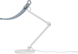
BenQ WiT e-Reading Designer Lamp' - ...?!)
The Fiilex is also popular (Les Walkling has one of these, I've noticed!).
It probably has technically the best light quality of the three options, by a small margin, according to the numbers - but in practise I find all three options to be effectively pretty much identical for print assessment purposes.
It's disadvantage is the roundness of the light source, which does rather create a pool-of-light effect. And again, annoying touch controls. But it's also another great option and we've been using one hear for years with much success (although likely to be replaced by the Ilford lights once we get another one!).