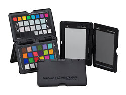
Calibrite ColorChecker Passport Photo 2
Get complete colour control from capture to edit with this essential tool for photographers and image makers.
Please note that we are open by appointment only (except for click and collect pickups once notified ready).
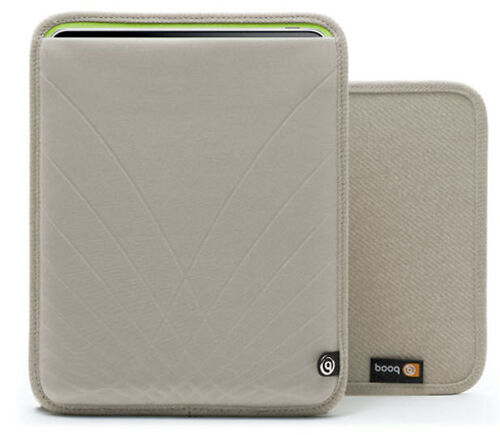
I recently purchased a cover for my iPad 2 – on the website it looks like a nice modern light warm grey colour.
When I received it, however, it proved to be quite a different colour – a dead ringer for pantyhose. Much browner and a kind of uncomfortable, zombie flesh tone. My ultra modern, sleek iPad looks like I’ve shoved it an old pair of Oma’s drawers.
I am officially a dissatisfied customer.
To be fair, web browsers and colour management is hard. I don’t really blame the store. Although I DO use a best in class NEC PA271W monitor, colour managed web browser, and if the image was really accurate and properly tagged, my screen would display it as accurately as anything can.
Who knows where the problem occurred – I’d guess a white balance problem (they should have used something like the ColorChecker Passport 2 in capture) – but it could be the ICC profile got dropped off in downstream processing, or any number of places – it’s hard to tell really.
Colour management, even in 2011 – or perhaps even more so – remains a complex chain, only as strong as the weakest link. If you’re not constantly vigilant with your colour, you’re going to disappoint someone somewhere!
(Note March 2012 – they have updated their image to make it look warmer brown now!)